
UI/UX Design Company in Australia
Pixbit Solutions researches, designs and tests app, web and product interfaces for Australian businesses, with accessibility built in and development-ready Figma files from one team.
Overview
What Does a UI/UX Design Company Do?
A UI/UX design company researches how people use a product, then designs the journeys, screens and design system that make it easy to use. For Australian businesses that means interviews and usability tests with local customers, accessibility built to WCAG 2.2 AA, and interfaces that meet the Digital Service Standard where government services are involved. Pixbit's designers work beside our developers, so the product you approve is the product that ships.
Trusted by 85+ companies
Good design is measured by what users do, not by how the screens look in a presentation.
Designers and Developers on One Team: Every screen is checked for build effort before you approve it, so the design you sign off is the design that ships.
Tested With Real Users: Prototypes go in front of people who match your customers, and we change the design based on what they actually do.
Accessible by Default: Contrast, focus order, text sizing and screen reader labels are designed in to WCAG 2.2 AA from the first wireframe.
Files Ready for Development: Organised Figma files, a documented design system and annotated specs that any competent developer can build from.

Research, design and testing for mobile apps, web platforms and dashboards, delivered by designers who work beside our engineers.


User Research and Testing

Journeys and Information Architecture

App and Web Interface Design

Clickable Prototypes

Design Systems

Accessibility Reviews

Interviews, analytics reviews and usability sessions with people who match your customers, so design decisions rest on evidence.

Planning a Redesign? Let's Find What Users Struggle With
Share the product and where users drop off. We will reply with a research plan and a scope for the redesign.
What Australian Digital Products Must Get Right
Design choices carry legal weight in Australia. These are the requirements we design for by default.
Accessibility Under the DDA
The Disability Discrimination Act applies to apps and websites, and the Australian Human Rights Commission points to WCAG 2.2 Level AA as the benchmark. We design and review against it.
Digital Service Standard
Australian Government digital services are assessed against the Digital Transformation Agency's Digital Service Standard. We design to its criteria when your product serves government users.
Clear Consent and Privacy
Consent screens, permission prompts and privacy notices that match the Australian Privacy Principles and ask only for data the feature needs.
Automated Decision Disclosures
From 10 December 2026, privacy policies must explain automated decisions that significantly affect people. We design clear explanations into the interface.
Honest Design Under Consumer Law
The Australian Consumer Law prohibits misleading conduct, so we avoid pre-ticked boxes, hidden subscription terms and confusing cancellation flows.
Our Design and Prototyping Toolkit
Figma, design tokens and component libraries that map directly to React, Next.js and Flutter code.
Front end
Back end
Database
Frameworks
Quality Assurance
HTML 5
JavaScript
CSS
Swift
Kotlin
Dart
Flutter
React
Next.js
Angular
Vue.js
Laravel
PHP
Selenium
MySQL
SQLite
Firebase
Redis
Node.js
Magento
MariaDB
Appium
MongoDB
Five stages, each ending with something you can review and approve.
Discover
We agree goals, users, success measures and constraints, and review any analytics or research you already have.
Research
Interviews, journey mapping and reviews of your current product reveal what users need and where they struggle today.
Design
Wireframes become visual designs for every key screen and breakpoint, built on a shared design system.
Prototype and Test
Clickable prototypes are tested with users, and the design is refined around what they did.
Handover
Developers receive organised Figma files, specs and a component library, and our designers stay available during the build.
UI/UX Design Services in Australia at a Glance
The key facts about UI/UX design with Pixbit Solutions for Australian businesses.
Services
User research, journeys, interface design, prototypes, design systems, accessibility reviews
Platforms
iOS, Android, web apps, websites and dashboards
Accessibility standard
WCAG 2.2 AA, as referenced by the Australian Human Rights Commission
Research
Interviews and usability tests with people who match your customers
Deliverables
Figma files, clickable prototype, design system, annotated specs
Ownership
All design files held in your own Figma account
Platforms we researched, designed and built, from property management to fintech payments.

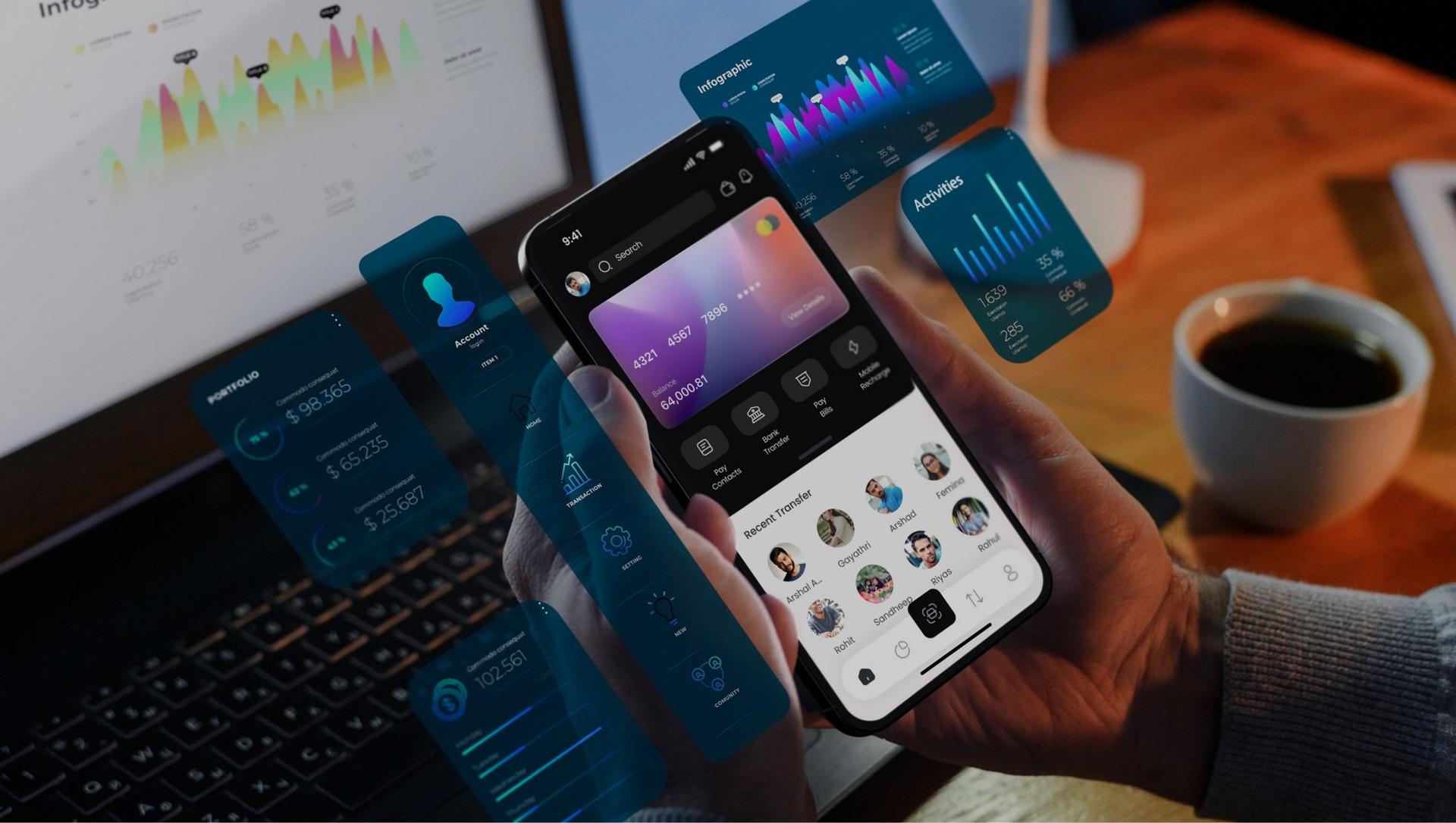
Test Every Design Before Development Starts
Clickable prototypes go in front of real users before development begins. Fixing a confusing flow in Figma is far easier than rebuilding it in code.

Other ways Pixbit supports Australian businesses.

iOS, Android and Flutter apps.

Fast, accessible websites and web applications.

Platforms and internal systems built around your workflows.

Launch a focused first release and learn fast.
What Australian businesses ask us before starting.
Have a Product to Design?
Let's Make It Happen
Share your product, your users and your goals. Pixbit scopes in a single discovery session.